In this tutorial, we will show you how to use, layouts algorithms, and graph properties to obtain a nice an clear graph. To do so, we will first import a file-system structure, and then use the graph properties to find specific files. (*.cpp or *.hpp ...)
To import a file-system we need to select the File System Directory importation tool which is in the menu File->Import->Misc.
A "file browser dialog" will pop-up to select the root directory that you want. On this dialog, you just need to select a directory for instance, your documents (On Windows : My Documents).
The importation plug in will work for some time, and a tree graph will appear representing the file system chosen.
To follow the rest of this tutorial you need to download this tulip graph file : Graph. Load this compressed tulip file into the software (File->Open).
This layout algorithm can be found in the menu Algorithm->Layout->Tree.
The bubble tree layout is very useful to notice directories that have the same structure.
In this section, we will try to locate those directories.
To have a better view on the tree, we will create a new NodeLinkDiagramComponent. Menu : View->NodeLinkDiagramComponent. When the new view is created, we need to re-organize the windows. Menu : Windows->Tile.
Now that we can see the both views at the same time, we will zoom in (right window). Select the magnifying glass tool, and draw a bounding box on the left side of the graph. Just like this :
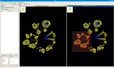
As you can see, two nodes looks very alike. By using the "Get Information " tool, we can get there ids : Node 1965 and node 2009. Indeed, those to directories have the same structure since they both contains plug-ins source files.
We will now re-center the view (View->Center View or Ctrl+Shift+C).
Let's say that we now want to study our graph without the plug-in directory. To delete it we have first to select it, and then select all its sub directories.
Select the plug-in directory : Use the Find tool, (
Edit->Findor Ctrl+F) with the fieldInput propertyset to "name", filter function set to "=" and filter value set to "plugins".Select all its sub-directories : Use the
Algorithm->Selection->Reachable Sub-Graphalgorithm with the field distance set to 50.Delete all the selection : press Del
Re-draw the bubble layout
Algorithm->Layout->Tree->Bubble Tree.
Following is what you should see :
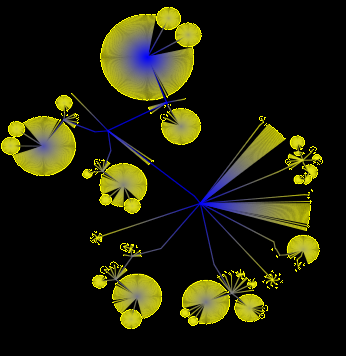
As you can see, the bubble tree layout can be quite useful.
This Layout algorithm can be found in the menu Algorithm->Layout->Tree.
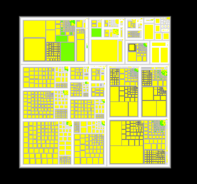
The treemap layout is very useful to notice large disk usage files.
This section will show you how to use the tree map layout
First, make sure that you have unchecked the Force Ratio option that you can access via the menu Options.
Apply the layout algorithm Algorithm->Layout->Tree->Squarified Tree Map with the following parameters :
Metric : set to "size".
Aspect Ratio : set to 1
Texture? : checked
Do not forget to refresh the views (Ctrl+Shift+R). Following is what you should see :
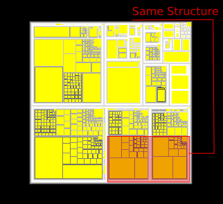
As you can see, we easily get a global information on the size of files. Which is the biggest, or, which is the smallest ? But, we can also see the structure of directories, since files and directories are nested nodes. See Wikipedia : Tree Maps for more information.
This layout can be find in the Algorithm->Layout->Tree->Improve Walker.
Use the following parameters :
Node Size : viewSize
Orientation : Left to right.
Orthogonal : Checked.
Layer Spacing : Default value.
Node Spacing : Default Value.
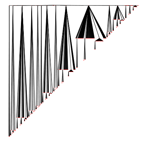
You should see a tree looking like this :
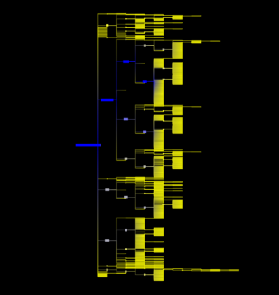
As you can see, the improve walker layout, is just a hierarchical layout. It is very useful to understand the tree structure of a file system.
First, right click on the view and select Dialog->Rendering parameters. In the Rendering Parameters dialog go in Layers tab and check the Nodes Label visibles box
We will now try to add labels to the nodes. To do so, select the node property called "name" in the info editor window, click on the button To Labels.
You should now see a graph looking like that :
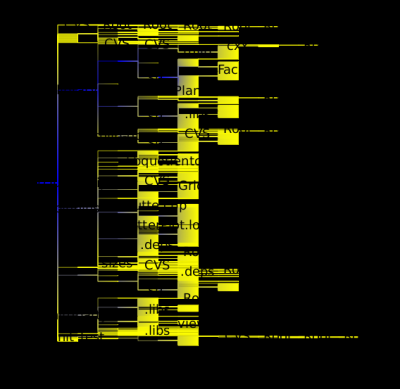
As you can see, the labels, don't fit in nodes and it is very hard to read the graph. To fix this problem go on rendering parameters dialog and in the Labels box, the field Type must be equal to "3D". Then, apply the Algorithm->Size->Fit To Label algorithm.
You should obtain something like this.
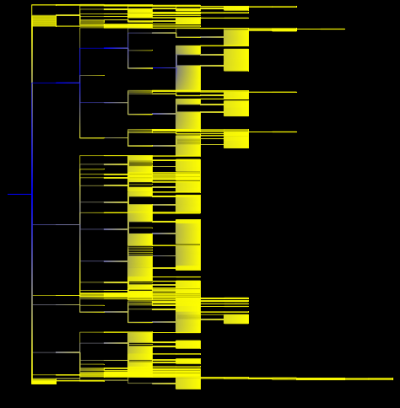
By zooming in we can see the labels :
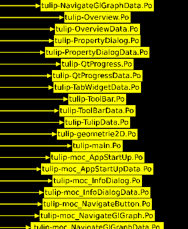
If you want to display the big file (high disc space) with big nodes, use the Algorithm->Size->Metric Mapping algorithm with the parameter called "property" set to "size".
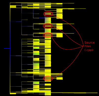
Now that our graph as a nice and clear layout, we would like to locate all of our Source files (*.cpp). To do so, we will use the Find tool (Edit->Find or Ctrl+F).
Use the following parameters :
Input Property : name
Filter : filter function set to "=" and filter value set to ".*cpp or .*hpp". For more details on regular expressions, follow this link : WikiPedia : Regex
Options : check the
Replaceradio button and selectOn nodes.
Now that our source files are selected, we will apply a different color to them.
In the info editor window, select the node property called "viewColor", check the selected only option. Now that we only see the "viewColor" property of the selected nodes, click on the button Set all and choose the color that you want. (We choosed green)
You should see a graph like the one following :
