After one year of development, over 2000 commits, about 300 bugs and feature requests fixed, two Release Candidates and lots of feedback, we present you Tulip 4.
This is the first release in the new Tulip 4.X series, which brings a gorgeous new UI, lots of speed improvements and a heavy lifting of the API and its documentations to simplify development of high-performance plug-ins.
Redesigned, more efficient UI
Let’s take a tour of the new UI together, see how it will simplify the analysis of data.
The Agent
Tulip4 is designed to simplify multi-tasking as much as possible, and to this end we introduce the Tulip Agent.
The later generations of Tulip 3 introduced the concept of perspective, to allow task-centric application to be easily created. Tulip 4 pushes this concept to the next level, where a perspective is a full-fledged application that can be started through the Tulip Agent.
The Tulip agent is the hub where the plug-ins can be installed, removed or updated. You can easily browse through plug-ins type, and search to quickly find what you are looking for.
But it is also the place where you can get a glimpse at the latest Tulip news, and the images published on the Tulip website.
The New Tulip Perspective
Tulip 3 was victim of its own evolution. As options and possibilities were added, the functionalitie s were crammed in tabs and menus, hiding most of the possibilities of Tulip to newcomers.
Tulip 4 starts with a clean slate, and brings an intuitive way of visualizing and manipulating graphs.
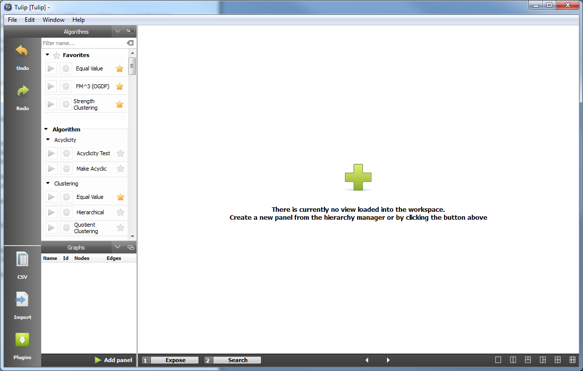
Here is what the new perspective looks like when you start it up (for those of you that recognized a touch of QtCreator, yes, we drew inspiration from their UI).

Let’s look at each component real quick, and we will go deeper after loading a graph to detail the interactions.
The most noticeable component is the workspace, on the right. This contains the views on the graphs, and is only different from the Tulip 3 Multiple Document Interface in that it has a few fixed layouts between which you can easily switch. This makes your data as visible as possible, without leaving empty screen space.
Then, on the left are two bars, one fixed, containing shortcuts to common operations such as undo, redo, importing a graph, and a link to the Agent’s plugin page, that will make the agent pop up.
The other contains the algorithms and the graph hierarchy. This way of presenting the algorithms offers great visibility for each of them, and allows to search easily through the plug-ins. As the number of plug-ins installed by default is now over one hundred, this became a necessity.
Now let’s import and visualize some data.
First, we can either go in File->Open, and a file chooser will appear, that can automatically import data from any file type supported by Tulip. You can as easily open a tulip tlp file or a graphviz dot file, or even a Pajek net file.
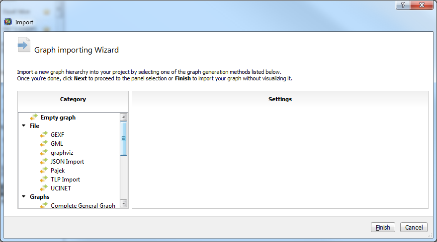
For the imports that require a bit more input, such as DIMACS, we need to use the Import button in the leftmost bar.

This wizard regroups all the formats that Tulip supports, as well as simple graph generators (e.g. Complete General Graph in the screenshot). This allows you to import data distributed in multiple files (e.g. DIMACS) or simply provide more options to simple imports.
Tulip 4 has all the tools Tulip3 had, and more. To analyze our data, let’s start by visualizing it.
To open a new view on your graph, there are multiple ways. Either you can double-click on your graph, or click on the add panel button below the graph hierarchy. When you start Tulip without data, you also have a button in the center of the workspace to do just that.

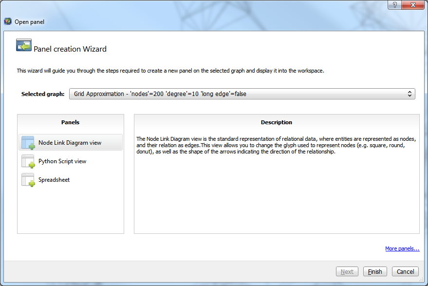
Now, we can select which view we want to open. This wizard contains a short description for every view, explaining what its intent is.
But one of the main features of this wizard, is the next pages. When importing huge graphs, the first drawing of the data could take a while, depending on the options. For instance, drawing all the labels of a graph of a few million elements was costly, and most likely not intended. Now you can configure the view before its first rendering, making the first drawing as fast as you want it to be, and closer to what you want it to look like.
To change the configuration of a view once it is created, you can find the same exact configuration page and more in the upper-right corner of the view. A simple click on these tabs will make them pop up.
Each view has its own interaction bar, which is scrollable when you have more interactors than space to display them. There is also a field allowing to select which sub-graph is displayed by the view. Finally, you have a small handle to drag and drop the view around and exchange its position with another view, and a button to close the view.
The Node Link Diagram view, the most used view of Tulip, has seen numerous improvements and quite a few shortcuts have been added for common operations.
Its configuration panel now has a global ‘apply settings’ button, to avoid multiple drawings while modifying the configuration.
The new quick access bar at the bottom gives shortcuts to some of the most performed actions, such as taking a screenshot of the view, change the background color, change all the nodes color, enable/disable color interpolation for the edges, enable/disable the edges, change the font color and font, and enable/disable the labels.
This bar also contains a new feature that allows to filter the nodes or edges depending on their values on a metric. When you click on the button, a small panel appears, showing the distribution of the nodes on a color or size scale. When you click on said scale, two handles appear at the top and bottom, allowing you to filter and decide which portion interests you the most.
The algorithm bar on the left allows you to easily find and run an algorithm. You can mark some algorithms as favorite, to quickly run those algorithms you use all the time. To run an algorithm you can either click on the green play button, which will run it on the graph in bold in the hierarchy view, or drag and drop it to the view containing the graph you want to run it on.
You can also drag and drop graphs from the hierarchy view to the view you want to display the graph, or use said v9iew graph selection box in its header.
The changes under the hood
Tulip 4 saw quite a lot of modifications under the hood to simplify its use.
First and foremost, a documentation was written for the API. It is not yet perfect nor complete, but will evolve in the future to be as complete and detailed as you, the user, want it to be.
The plug-in system was overhauled to make it easier to find existing plug-ins and remove some historical code.
We also changed the interfaces for View, Interactor and Perspective, as our vision for these elements changed.
We have refactored the rendering engine to allow you to write custom rendering code while still having the power of Tulip, with working selection, ability to use the scene, camera and layer system easily and such.
Download links
As usual, binaries are available for Windows and MacOS platforms from our SourceForge page. Source packages can be download from the same page for other distributions as well:
Windows
MacOS
Sources packages
(.zip format)


