Table of Contents
The goal of this part is to create a graph, save it, and apply the most common analysis operations.
Click menu
File → Import → Graph.Select a generation method, for instance
Grid approximationand click OK.
A graph with nodes and edges is now displayed.
With the mouse wheel, you can zoom in an out.
Click and drag to move the graph.
Shift-click rotates the graph around x and y axis, Ctrl-click rotates around the z axis.
To reset the view, right-click and select View → Center view.
Click Menu
File → New.Select the
 tool.
Click on a few different places in the "Node Link Diagram View" subwindow: each click adds a node.
Now, add a few links: for each link, click on the source node, then on the target node.
tool.
Click on a few different places in the "Node Link Diagram View" subwindow: each click adds a node.
Now, add a few links: for each link, click on the source node, then on the target node.-
Click
View Editor(bottom left corner) →Rendering parameters → arrowsto display or hide them. ClickLayer managerand uncheckEdgesthen clickApplyto hide the edges. The first column (visibility) determines whether this element is visible, the second column determines stencil: when a layer has the stencil, it is displayed on top of layers who do not. To delete an element, select the
 tool and click the element.
To save your work in Tulip's own file format (.tlp), click menu File → Save or File → Save as.
To save it in another file format (only GML and TLP are supported without any plugin installed),
click menu File → Export.
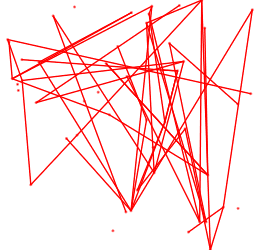
Generate a graph: click Menu File → Import → Graph → Random General Graph, type in "50" in the nodes field and "50" edges.
Since node positions are random, the layout is tangled:
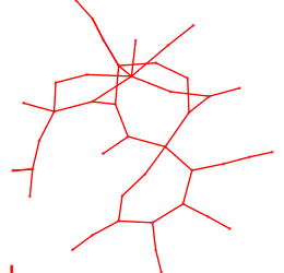
To improve it, let's apply a Layout algorithm: click Algorithm → Layout → Force directed → GEM.
It computes a good position for each node:
Some layout algorithms can only be applied to graphs belonging to a specific graph class.
For instance, the Bubble Tree algorithm can only be applied on a tree.
There are algortihms for computing Layout, Measures, Selection, Clustering (in General) and more.
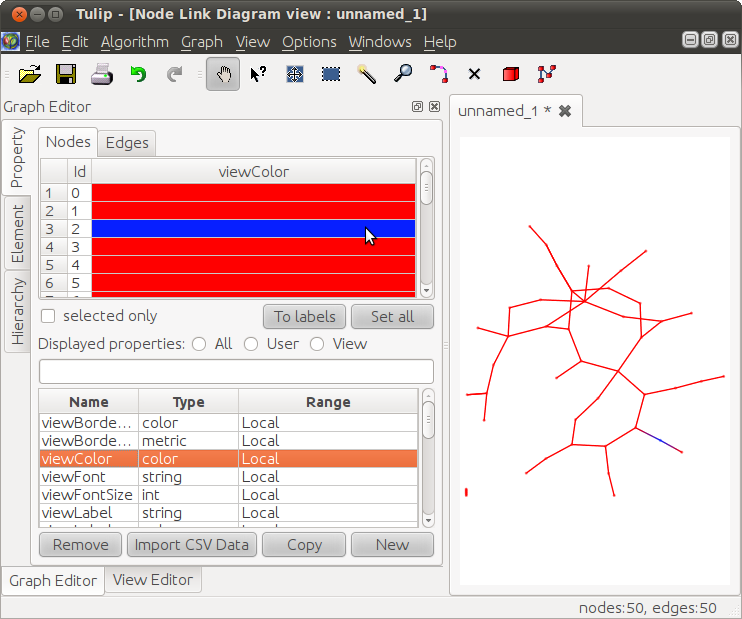
Graph Editor (bottom left corner) → Properties (tab on the left),
and in the bottom part click viewColor.
This property stores, for each node, the color used to display it. In the upper part,
double-click a red cell and choose a blueish color, click OK,
and press Enter to update the graph display on the right:
To compute more meaningful colors, click menu Algorithm → Measure → Graph → Betweeness centrality,
this computes a centrality for each node. The graph is now displayed with colors depending on this metric
(nodes at the center have a high centrality and are thus blue, node at the border have a low centrality and are thus red):
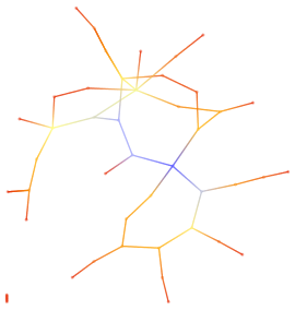
The result of this computation has been stored in the viewMetric property:
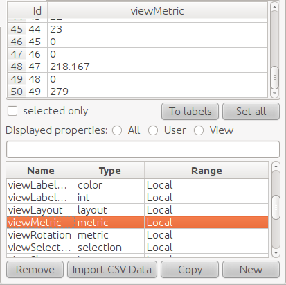
But if we run another algorithm, it will overwrite the viewMetric property. So, let's copy the result into another property:
click viewMetric then copy and type in "centrality" (as a new property).
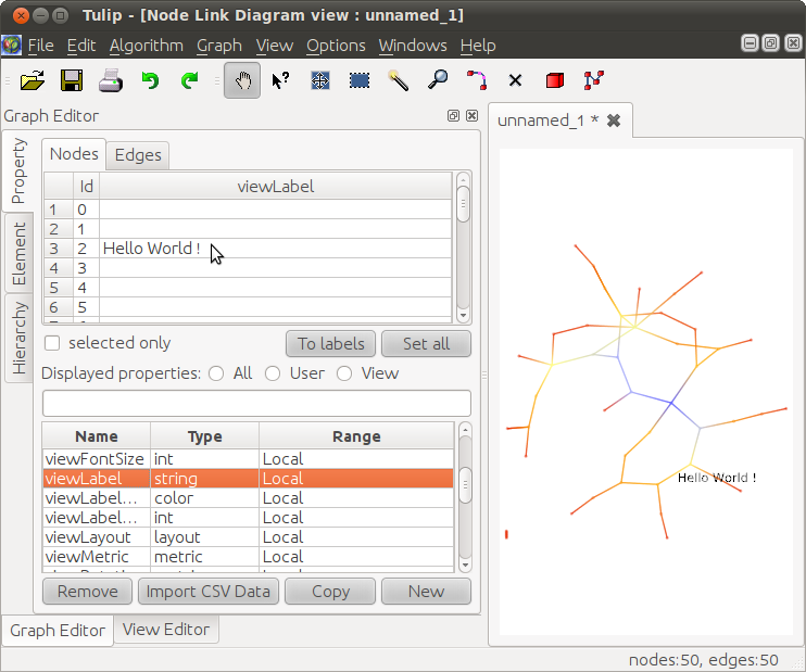
Now, let's add labels. In the bottom part (the list of properties), click viewLabel
(not "viewLabel..."),
then double-click the cell under the mouse in the picture below, and type in "Hello World !".
Click OK, then press Enter to update the display. The node with id 2 has a label:
To get more meaningful labels, let's apply an algorithm.
Click Algorithm → Measure → Misc → Id. The result of this metric (here, the identifier of each node)
has been stored in the viewMetric property (overwriting the previously computed centrality).
Also, new colors have been computed to represent this property, but do not pay attention to them for now:
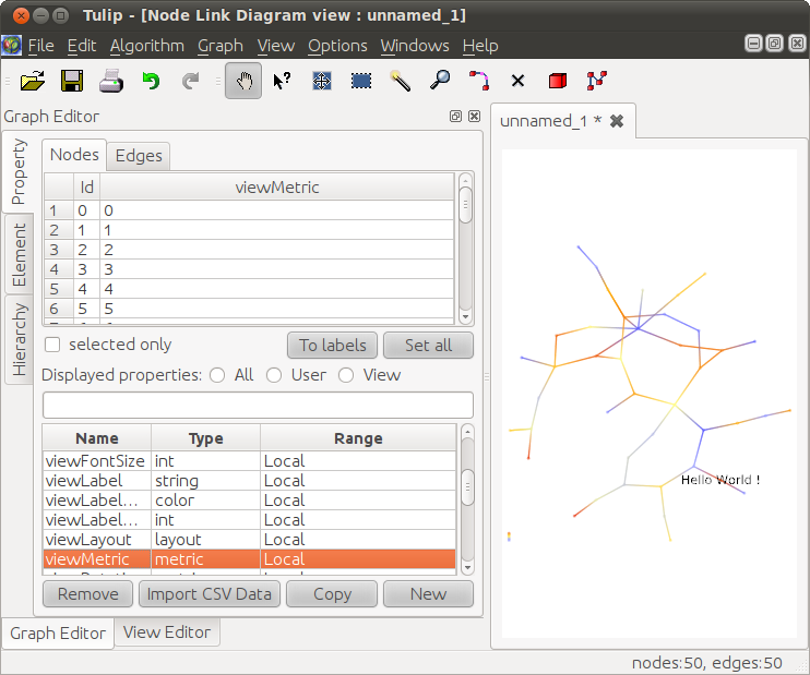
To display this viewMetric property as labels, click viewMetric then To labels.
(One can see that the colors represent the id: small id have a reddish color, while high id have a blueish color.)
To restore the colors representing centralilty, click
Algorithm → Color → Color mapping and select "centrality" under "linear/uniform property". Click OK.
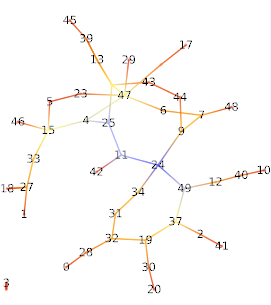
The final picture should look like this (since the graph is random, the exact structure can be different):
