First, download and open this tulip graph file.
This graph represent the relations between authors, conferences and papers. To distinguish paper, conferences and authors, we will re-color them :
Select all papers : Press Ctrl+F to display the find tool. In the Input Property field, select the property "type". Set the filter to "=", and the filter value to '0', then click on the Find button.
Re-color the nodes in red : Select the Property tab (in the Graph Editor tab in the left dock). Select the 'viewColor' property, and check the "selected only" option to only consider selected nodes. Then, click on the "Set all" button to define a new color for these nodes (e.g. red).
To find a property more easily, you can enter the first letters of the property name in the text box just above the list of properties.
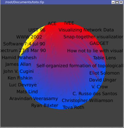
Repeat the actions above, for authors (type = 2 ) and conferences (type = 1) with other colors (e.g. blue and yellow).
You should obtain something like this :
Select an author :
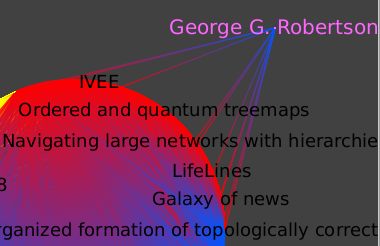
Let's look at a single author more closely, for instance George Robertson. First, let's select that node by hitting Ctrl+F for the find tool, choosing the "titleshort" property, the "=" as filtering function, and the regular expression "G.*Rob.*" as filter value. We can have a rough estimate of how connected he is by moving him away from the center of the graph temporarily.
Following is what you should get :
Go deeper :
We then select Algorithm->Selection->Reachable Sub-Graph, leaving direction to 0 (outgoing edges), startingNodes to viewSelection (nodes selected, in our case simply Mr Robertson),
and a distance of 1.
We then select Edit->Create Subgraph to save this selection for further manipulation, naming it "GR.1hop.outgoing".
We then select this new subgraph in the hierarchy tab.
We can deselect the nodes now, either using the selection interactor and clicking away from any node or edge, either by selection 'viewSelection' and setting all the values to false.
To render this graph readable, we will first apply the Algorithm->Size->Auto Sizing algorithm, then change the layout for Algorithm->Layout->Hierarchical->Hierarchical Graph.
Now, this layout is better, but there is an even better one you can find on the Tulip plug-ins server (Help->Plugins->LaBRI Universite Bordeaux 1->Layout->Sugiyama (OGDF)).
Once this is installed, you can find it in Algorithm->Layout->Hierarchical->Sugiyama (OGDF)
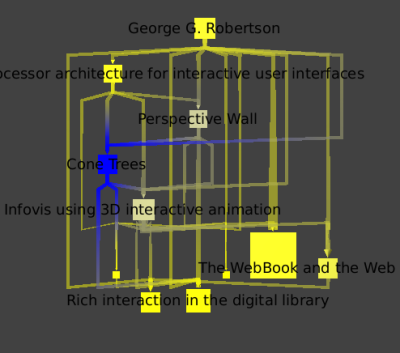
We can see which papers were published first, as they are cited by the later ones.
Robertson has 11 papers referenced in this database.
If we apply a coloring by the number of citations (Algorithm->Color->Metric Mapping, with field property set to "arityOut" )
we can clearly see that "Cone Trees" is his most influential work.
We then return to the main graph, and make sure the Robertson node is away from the others. We then select all the papers nodes by hitting Ctrl+F for the find tool, choosing the type property, the "=" filter, and the value 0 for papers. We want to add Robertson and all the edges going from or to this node to our selection. To do so, we need the selection tool, and by pressing the Ctrl key while drawing a rectangle encompassing the node and all of its edges, we add to our current selection. We then save this selection to a new subgraph that we name GRCitesub.
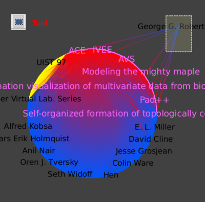
In the new subgraph, we then select the Robertson node.
We use the Algorithm->Selection->Reachable Sub-Graph algorithm again, pick a depth of 2 to find all papers that cite a paper written by Robertson.
Now we want to remove any node or edge that is not selected.
We can invert the selection (Edit->Invert Selection or Ctrl + I) and delete (Del) the resulting selection.
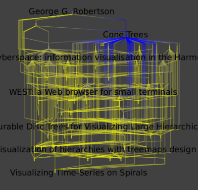
This leaves us with Robertson and all his papers, and the papers citing his papers.
Applying a hierarchical layout will look like the image below.
You can now close this graph since we are going to use an other one for the following of this tutorial. The next graph is similar to the this one but, has coauthorship edges linking authors who write papers together. You can download it and open it in tulip.
Here we focus on the relationship between two authors, in this case Robertson and Card.
To select them use the find tool, with, at the first time the regular expressions : "G.*Rob.*". And at a second time, the regular expression ".*Card.*" and the "add" option checked. To move those selected nodes away from the main layout, use the "moving selection" tool. If you click on one of the node, you will be able to move both nodes at the same time.
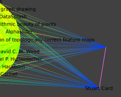
Select Card and Roberts at the same time ( Press Shift while clicking on a node). Select all their neighbors by applying the Algorithm->Selection->Reachable Sub-Graph algorithm with distance 1. Create a new Subgraph.
Following is a hierarchical layout of the neighborhood of all outgoing edges one hop away; that is, the publications and coauthors of the union of Card and Robertson.
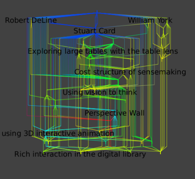
You can repeat those operations for Robertson only and Card only :
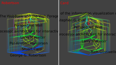
The similarity of these final three images shows the very strong ties between these two authors.
You can now close this graph since we are going to use an other one for the following of this tutorial. The next graph is similar to the old one but, has links between author and conference by following links from author to paper, and from paper to conference. Then, delete papers. You can download it and open it in tulip.
To show the large-scale structure of this dataset, we colored Authors in green and conferences in blue with a GEM layout (Algorithm->Layout->Force Directed->GEM). We deleted all the papers nodes.
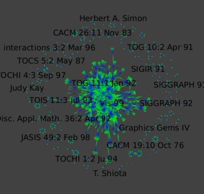
By zooming in :
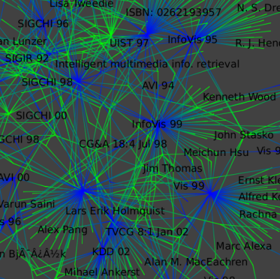
We select only the large connected component (the big set of nodes) : Select a fiew nodes in the center of the component and run the "Reachable Subgraph" selection algorithm with distance set to 50.
Color the authors by the Strahler metric: Run the Algorithm->Measure->Graph->Strahler algorithm and then a Algorithm->Color->Metric Mapping algorithm.
Finally, we color papers in white.
This layout, shows the branching structure of the dataset.
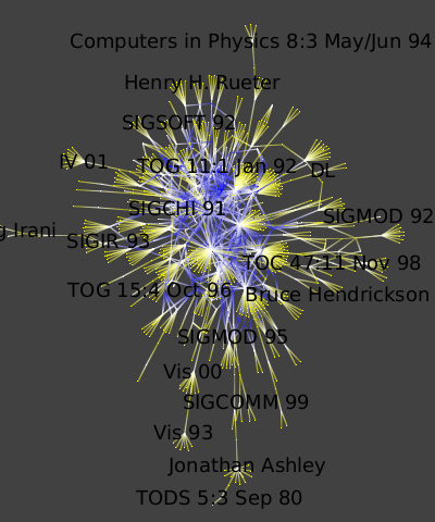
To distinguish authors and conferences :
Select all authors (nodes of type 2) and set their viewLabelColor property to red.
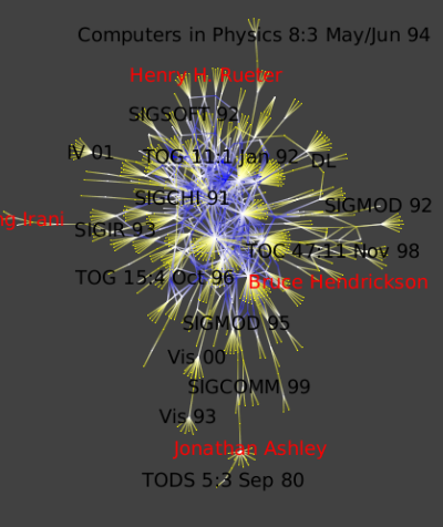
It is very simple to see top conferences since they are the ones where the number of authors is high. The Metric Degree will help us to highlight them (Algorithm->Measure->Graph->Degree ).
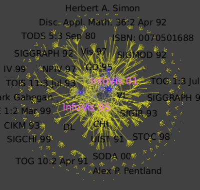
Run the Algorithm->Measure->Graph->Strahler algorithm to see strong ties between conferences and authors :
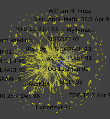
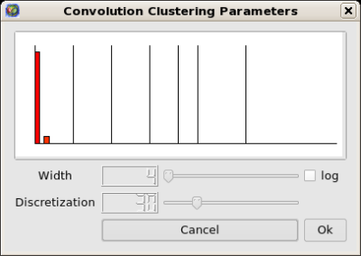
Then run the Algorithm->General->Convolution, the value of the "discretization" parameter should be near 30 to obtain 5 clusters ) (Picture 1) to obtain the following clusters (Picture 2):
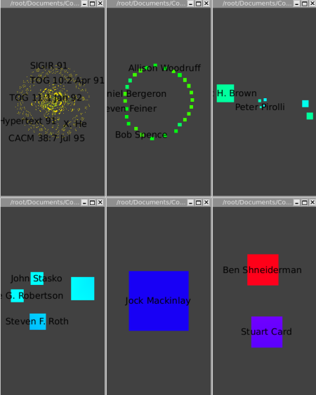
The Strahler-Convolution clustering yields five clusters, according to increasing centrality. The first cluster is mostly yellow, and contains most of the data. The second cluster contains a next tier of 26 authors that have had a relatively strong impact. The third cluster contains a group of 7 influential authors (Chi, Bederson, Eick, Rao, Pirolli, Ward, and Brown), and the fourth cluster (Roth, Robertson, Keim, and Stasko) is yet more central. The fifth cluster is the single node of Mackinlay, and the last one is Card and Shneiderman. Our automatic clustering method clearly yields very believeable results in this case.
In the last section, we will use an other graph. Please download it and open it in tulip.
To be able to see the labels within metanode check the "metanode label" visible box in the Layers tab in Rendering Parameters dialog.
The clusters have been computed using the Algorithm->General->Strength clustering algorithm.
The overview image from the previous section, showing the graph of all authors and papers, is extremely cluttered. In the previous task we show one way to extricate more information, by finding the most important items via convolution clustering. Another clustering approach, small-worlds clustering, allows us to instead navigate through a hierarchical subdivision of the entire dataset. The simplified overview allows us to understand the graph's high level structure. The strength metric computes the number of cycles of length 3 and 4 passing through each edge, normalized by the maximum possible value. The first image shows the clustered dataset. Small-world navigation is useful when exploring an unfamiliar graph to quickly find the structure of complex components. The eccentricity metric (Algorithm->Measure->Graph->Eccentricity), which measures whether nodes are peripheral (here in yellow) or central (here in blue), guides us to complexity immediately. This metric is O(n^3), but the small-world decomposition simplifies the graph, making the computation tractable.
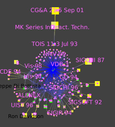
The picture shows zooming in towards the node that has many blue lines leading to it.
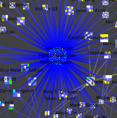
We then jump inside that cluster (Select the metanode, Right Click, Go inside), which is itself a small-world graph.
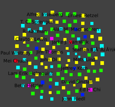
We once again zoom towards the most central node with many blue edges, where we see a cluster that has the InfoVis 96 conference and all the authors who only published the infovis community in that year.
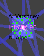
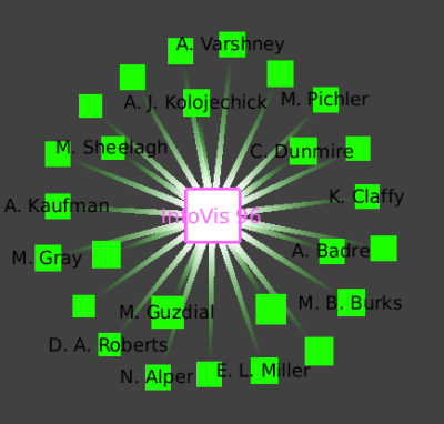
We see this star shape small-world decomposition only for the InfoVis symposia, because of the nature of this dataset: it is only the InfoVis symposia that have a complete set of authors and papers available.